Web Design / Branding
EcoSentience
EcoSentience is building Aurora AI, an environmental monitoring system for woodland conservation. Aurora processes data from sensor networks to help researchers analyse ecosystem patterns, educate stakeholders about environmental changes, and support evidence-based conservation decisions.
I audited their existing website to identify opportunities for clearer brand positioning and improved user experience across their diverse stakeholder groups. I led the design process end-to-end and implemented it in WordPress. It is an ongoing collaboration with EcoSentience to curate digital experiences that help the public engage with woodland conservation.
Role
Duration
Design Researcher4 months / Ongoing
Problem
EcoSentience is building Aurora AI system that analyses complex environmental data from sensor networks deployed in greenhouses and natural habitats. It processes multi-dimensional environmental data (temperature, humidity, soil moisture, weather patterns) to generate predictive insights and recommendations.
So, there are three key goals of the design:
Considerations around accessibility for multi-stakeholder technology:
The goal was to balance design for varying levels of technical literacy and decision making contexts.
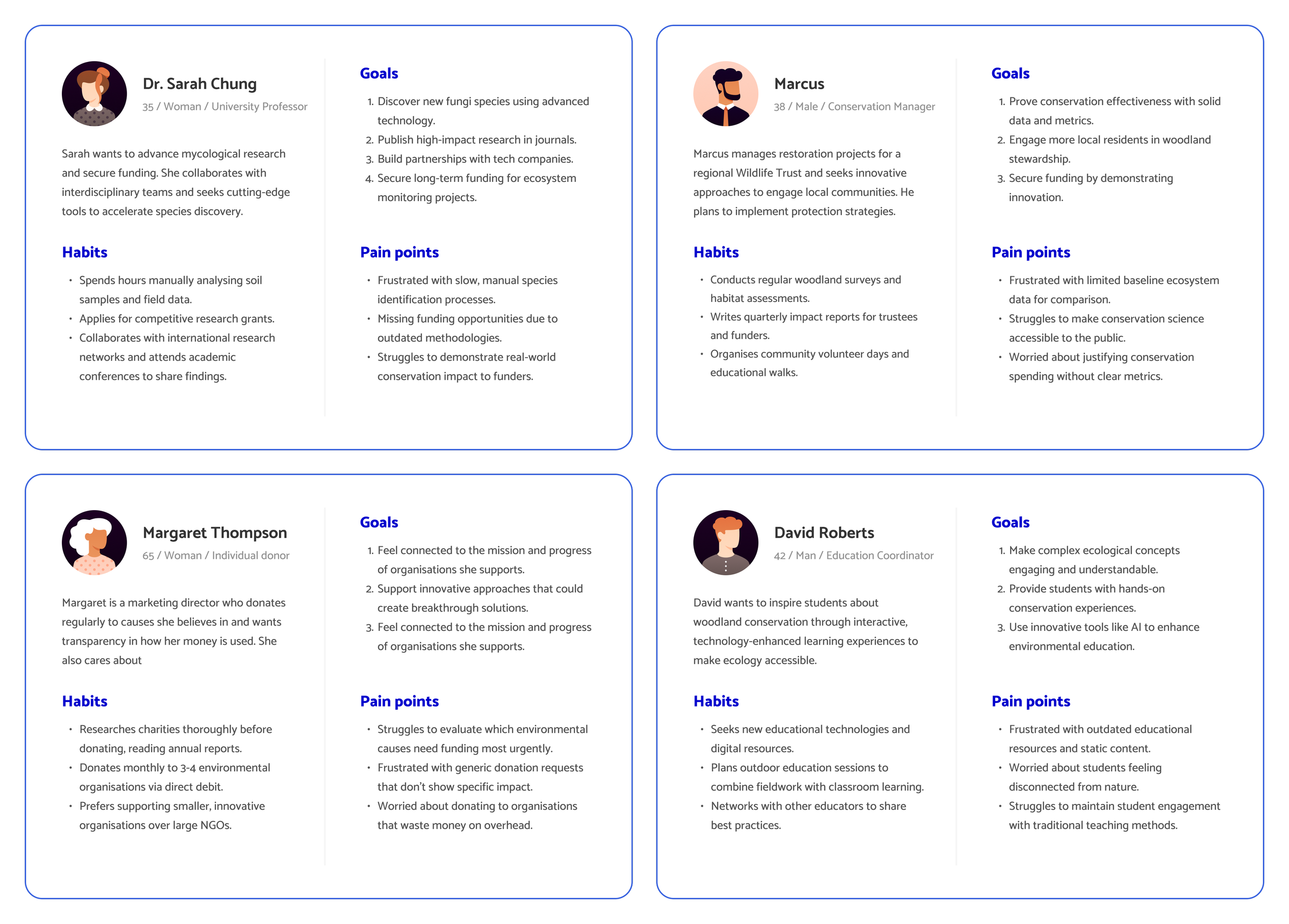
EcoSentience serves stakeholders with vastly different needs. For example: commercial nurseries need quick operational information, researchers need detailed historical patterns, conservationists need long-term monitoring outcomes, donors need impact metrics and volunteers.
Building context adaptive interface(s) for field and office environments:
The goal was to ensure that the interface supports the users’ diverse work contexts.
Given the nature of technology, field researchers and volunteers might access the system outdoors on mobile devices in unpredictable conditions (bright sunlight, limited connectivity, gloved hands). While office-based researchers and administrators work from desktops with multiple monitors and stable connections. The responsive design addresses these real-world constraints by prioritising critical data visibility and touch-friendly controls on mobile.
Increase donor engagement through impact visualisation:
The goal was to translate complex environmental data into compelling narratives that drive donations.
Donors need clear evidence of conservation impact rather than technical metrics. So, the design emphasises accessible success stories, and strategic placement of calls-to-action at moments of emotional engagement with positive outcomes or urgent needs.
Design Process
Drawing up personas
Through several discussions with the client, I continued refining the product positioning and evaluated competitors in the similar space. I noticed that the client’s existing website wasn’t clearly communicating the uniqueness of Aurora and left me feeling confused about what was EcoSentience actually doing.
Establishing design system foundations
Initially, I focussed on building the information architecture and content strategy.
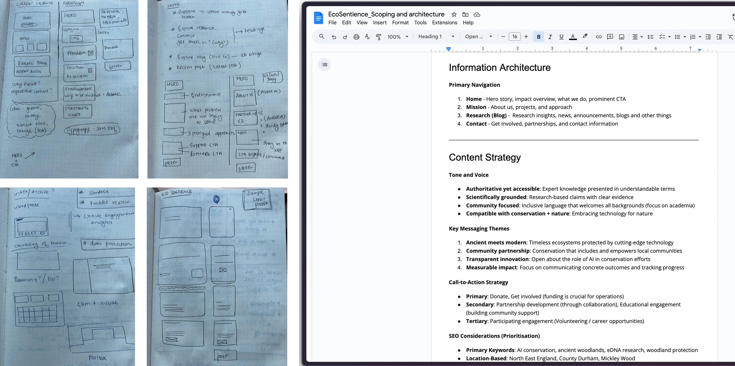
Information architecture:
I restructured the navigation around user intent rather than features, creating four primary pathways for users with different priorities (Mission, Approach, Research and Contact). I evaluated the comprehensiveness of the information architecture with the client using the personas to create different workflows for diverse user groups.
Content strategy:
I developed distinct tonal frameworks for each audience. For example, the focus for researchers would be technical detail oriented, narrative + action focussed for donors. SEO strategy targeted keywords around "environmental monitoring systems," "greenhouse automation," and "conservation technology" to reach both commercial and research audiences.
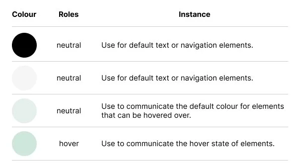
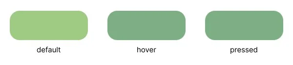
Colour:
Aurora’s philosophy reflect the Triquetra principle of interconnectedness informing the core product's structure around three core user pathways: Monitor, Analyse, and Impact. This influenced the design system choices as well. I prioritised colours that prioritised calmness, clarity and evoke natural environments. The palette is WCAG 2.2 compliant, ensuring legibility across diverse user groups and varied contexts, from bright field conditions to dim office environments.
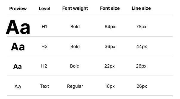
Typography:
I tested different alternatives and decided on Inter as it clarity at small sizes. The font's neutral, systematic character reinforces scientific credibility, while its geometric consistency provides visual structure that guides users through complex information without overwhelming them.
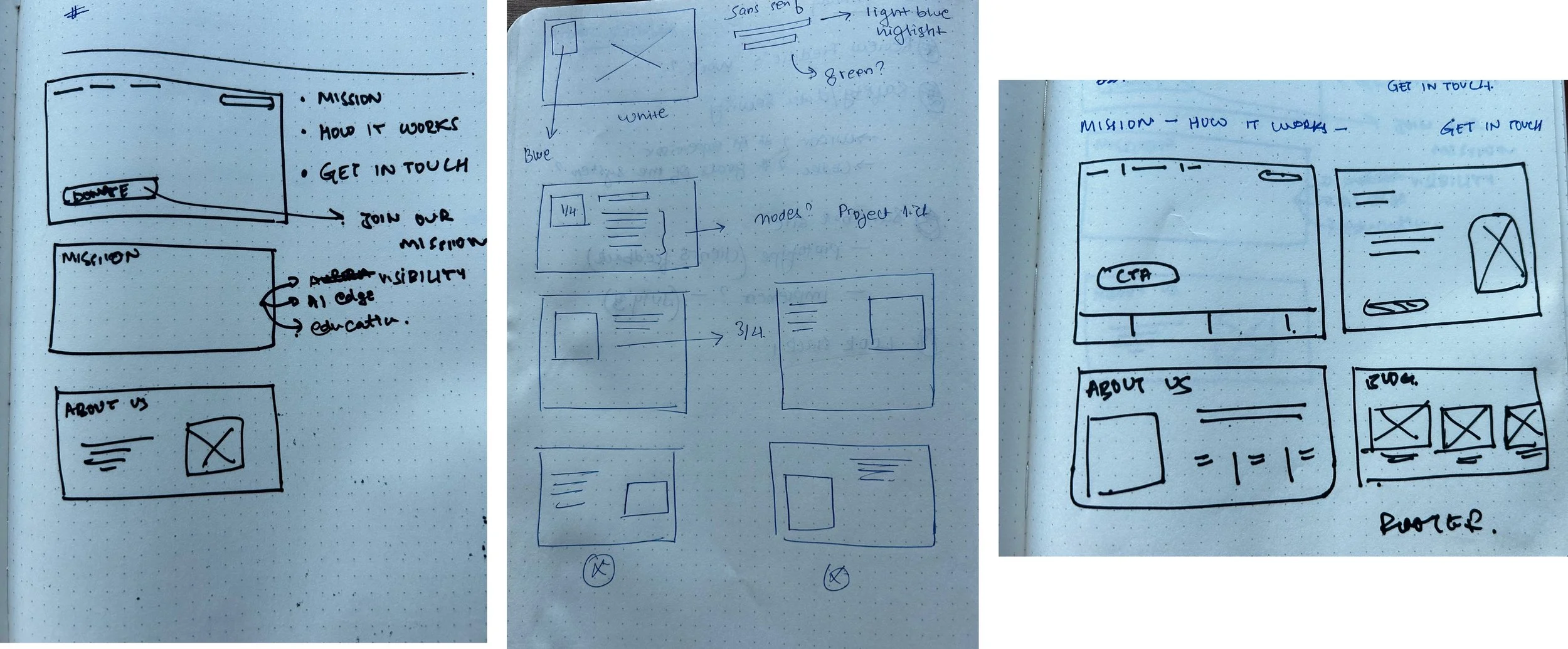
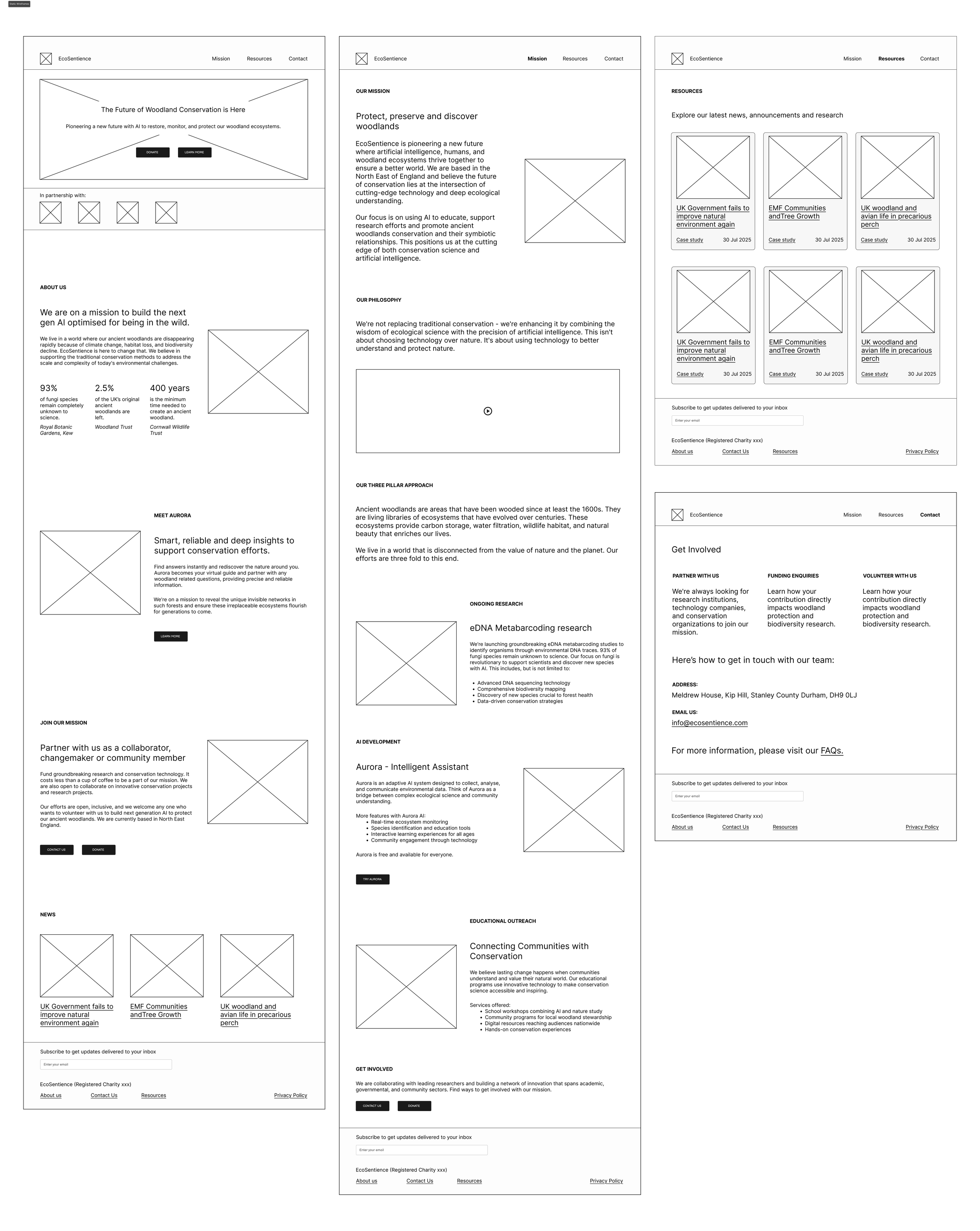
Prototyping
Through iterative sketching and prototyping, I developed a responsive design system that addressed multi-stakeholder needs while remaining feasible for WordPress implementation. The progression from rough sketches to refined Figma mockups shows how the design evolved to prioritise mobile field use, data clarity, and conversion optimisation
Current build + WIP
Through iterative sketching and prototyping, I developed a responsive design system that addressed multi-stakeholder needs while remaining feasible for WordPress implementation. The progression from rough sketches to refined Figma mockups shows how the design evolved to prioritise mobile field use, data clarity, and conversion optimisation